
Featured image source: Range Life Wine
Food packaging is the material used to wrap or protect goods.
Food packaging design shows what your brand stands for, what your product is and who it is for. It is the creation of the outside of a product; its shape, colour, material and design elements that make it suitable for marketing purposes.
P
ackaging design is a crucial part in making or breaking a product. Not only does it need to stand out but it has to be unique, authentic, memorable, relatable and show exactly what it is… Not an easy job, indeed.
If you’re wandering the internet trying to figure out what in the world you are going to design for your own food packaging, you’ve arrived at the right place!
Our team decided to look at several options and styles you might want to get on board with. We tell you why it works and why it could be for you.
This might help you start with the process but don’t forget the number one rule: whatever you create, don’t design it for yourself. Do it to appeal to your consumer.
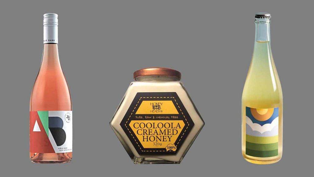
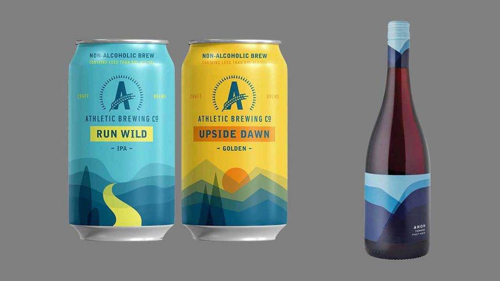
Option 1: Go with simple geometry
A simple way to make a big impact is to choose bold colouring with geometric patterns for your food packaging.
Extremely abstract, it gives the consumer an idea of what the product is or what the brand stands for. It seems very simple at first but it has a big impact on the shelves.
Option 2: Travel back in time – old is new again
There are several reasons to go old school.
- You want to give the impression of a long running business with a tradition of know-how. This is popular with alcohol brands – especially whiskey – and conveys excellence of their product.
- You want to do a throwback to celebrate an anniversary and offer a limited edition of your product reverted to its original design.
- You want to trigger an emotion in your consumer: usually tender nostalgia of a time long-gone.
- You want to create a full experience – from the unboxing to the use of the product. Your consumers will feel like they time-travelled back to their grandparent’s era.
“trigger an emotion in your consumer”

Option 3: Arty and stylish
You might want to consider that option to attract a high-end demographic.
Draw inspiration from paintings and textures to dress you product in fine art. The usual association with the art industry is that it’s expensive and for the elite. Consider it if it aligns with your values and your audience.
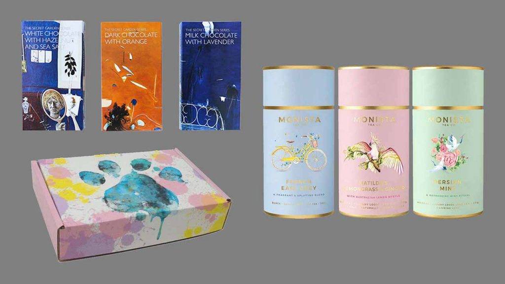
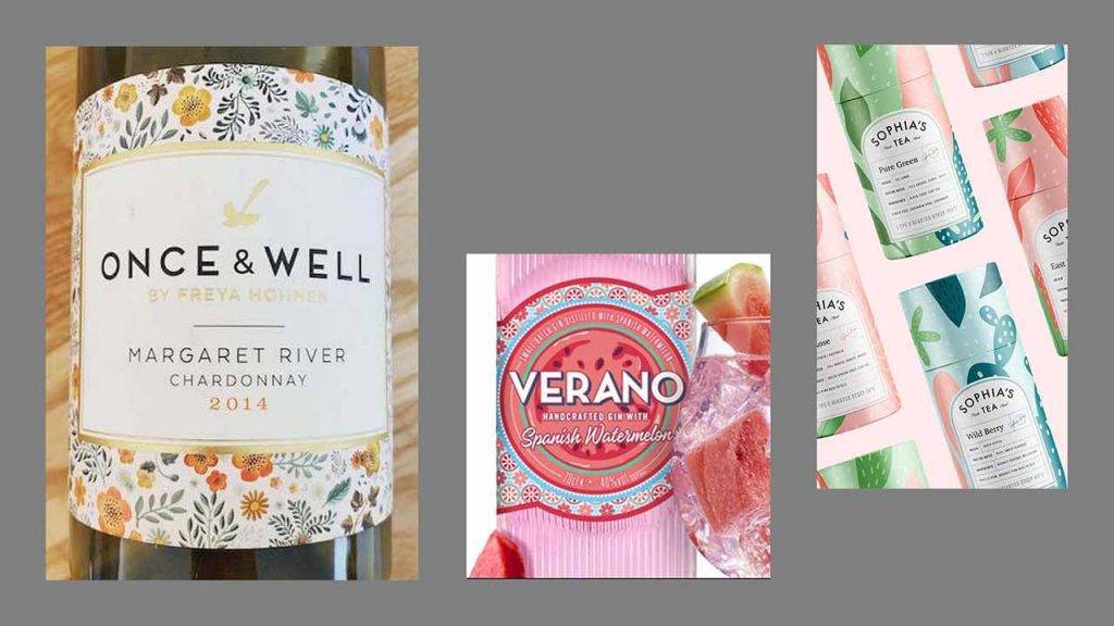
Option 4: Tiny patterns can make a big difference
Abstract or realistic, tiny illustrated patterns are used to embellish the product and to give a feel of what’s inside – especially useful for packaging that doesn’t allow for a clear plastic window, or another method of showing the contents of the package.
The artistic rendering outside will influence the perception of what’s inside without overwhelming the consumer with a lot of other information.
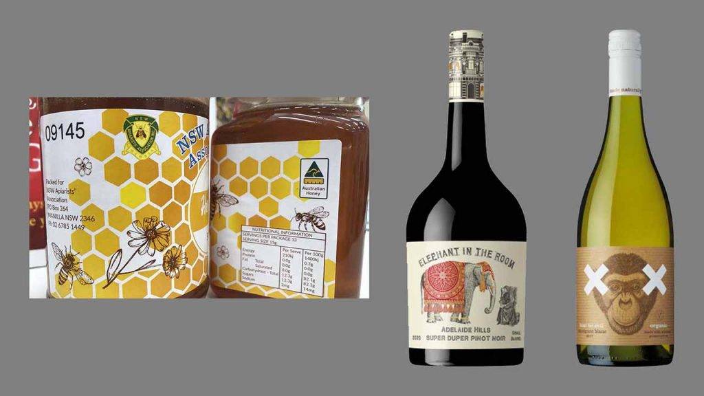
Option 5: Go with literal and realistic imagery
People, animals or insects shown in a visually accurate form… This choice doesn’t leave anything open to interpretation. It almost feels like a technical pencil illustration from a scientific review.
Once again with this style, you’d celebrate artistic minimalism. Well done and well-thought, it clearly conveys a story and a feeling – if you get a smile on your potential consumer’s face, it’s a win!
“if you get a smile on your potential consumer’s face, it’s a win!”
Option 6: Adding depth with textures
Bold or subtle association of colours, soft patterns or edgy shapes – play with your brand’s guidelines. Create a ‘collage’ or ‘texture’ that will give softness and playfulness to your brand. Your creativity is the limit here!
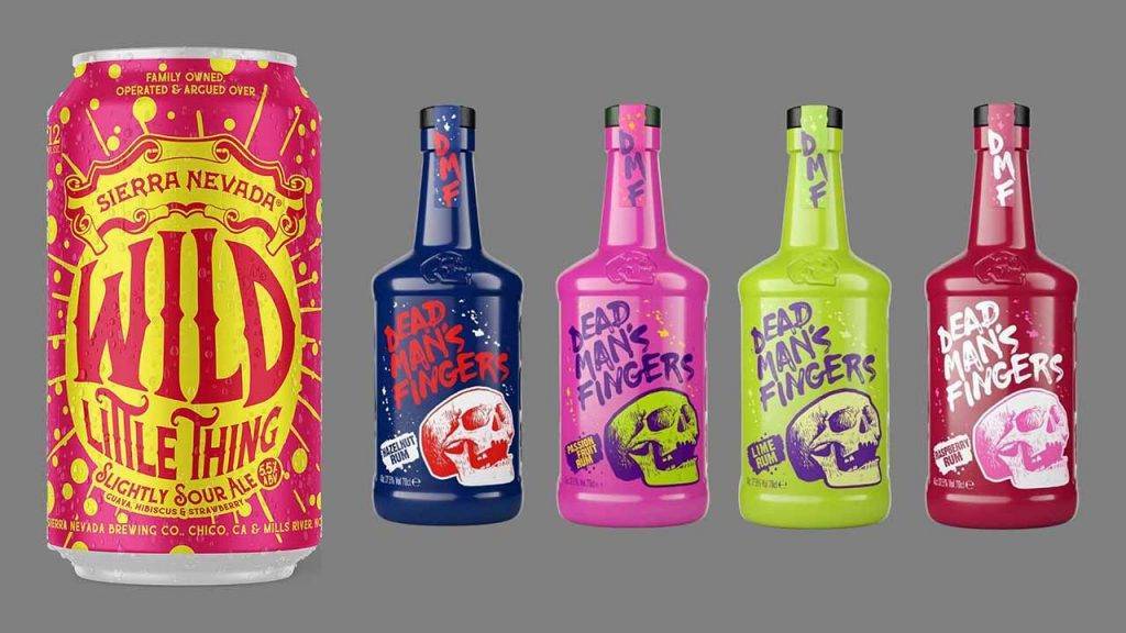
Option 7: Psychedelic fonts
Put the name front and center, and have fun with it!
This option gives your product and your brand a fun, young vibe in direct opposition with classy, uptight products.
A little caution is appropriate however: don’t use a font just for the sake of using a fun font. It has to suit your product, reflect the mood and the emotion you want to convey. Don’t use it just because it’s fashionable or risk losing your audience.
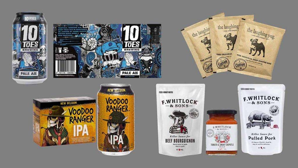
Option 8: The power of storytelling
People love stories! Especially funny stories.
If you have a cool brand name or a witty one, we definitely recommend you explore this option. A mascot can be super effective to appeal to a certain demographic. Make it fun and relatable to your audience and you’ll get a laugh. Which gets them one step closer from the purchase.
Option 9: Let the copy speak for itself
As graphic designers we know when to recognise that the copy is so good it should stand on its own. A nice font, a bold colour and no clutter – that’s the only thing the product needs to draw attention and deliver the right information quicker.
Sometimes a simple packaging design in a complex world is what will catch your consumer’s eye.
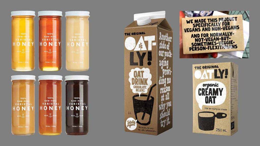
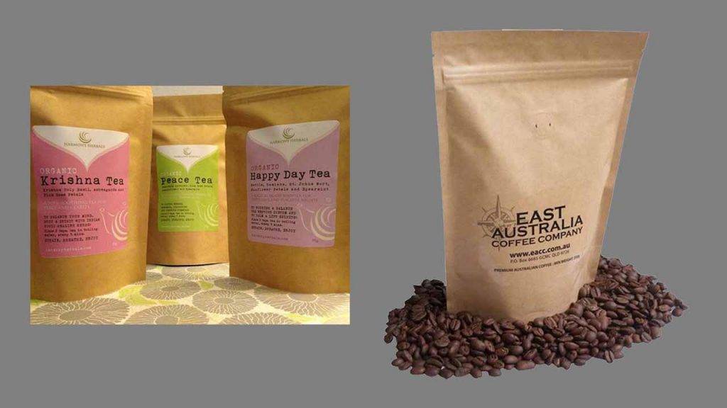
Option 10: The rise of Eco-Friendly packaging
In our day and age, this option is gaining a lot of momentum. Once again, this choice is undeniably linked to your audience and your brand values.
This is a relatively new area, meaning it’s a land of opportunities for us! For now, options are limited: paper bags and carton boxes for packaging. Whether you innovate or take advantage of the material, if you have a great idea it is worth giving it a try! You might benefit a lot from it.
“innovate or take advantage of the material”
Option 11: Mix and match your options
Bright, geometric simple with great copy or realistic imagery, psychedelic font, repetitive patterns and great storytelling, we hope these few options will have inspired you to create your own mix-and-match packaging design option.
These brands certainly mixed it up and we love what they came up with!

At Visual Targets, we are experts in custom packaging design, so we would like to work with you to create the right and most impactful packaging for your product.
.

Creative genius, talented wordsmith and all-rounder copywriter up for the grabs! If you can’t stand the look of your copy right now, she’ll shape your rambles into the most compelling words.
Marie Rene | LinkedIn

