
Case Study | Ryan’s Rustic Creations’ Wax Label
R
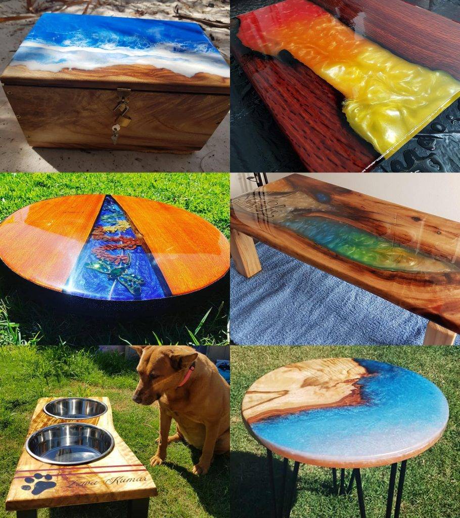
yan produces stunning work. He makes the most delightful and dynamic looking wood creations – from the coffee table to the cutting board, to the dog bowls holders – to which he gives a charming rustic style.
Ryan spends a lot of his time and energy to make a piece before he joyfully surrenders it to the hands of his clients. But not before giving some caring instructions, the main one being: use some wax to keep the wood in good condition. And not any wax! His homemade wood wax by Kristy.
And because Ryan is a talented and creative craftsman, he decided to create a label for his packaging. That’s where Visual Targets came in.
.
The Story Of Ryan
When Ryan contacted Visual Targets through social media, at first he was making an inquiry to just to print his label. He had already designed it in a word document and he was clear on what he wanted.
Even though Ryan’s label design was good, our team offered to enhance Ryan’s design before printing it. We wanted him to be proud to showcase his product. Especially such a unique homemade product.
Our objectives were to:
- make it clear what the product was
- enhance the design
- present the information in an easy way to read
- make it more professional looking and impactful
“proud to showcase his product”
.
The Challenges and Opportunities
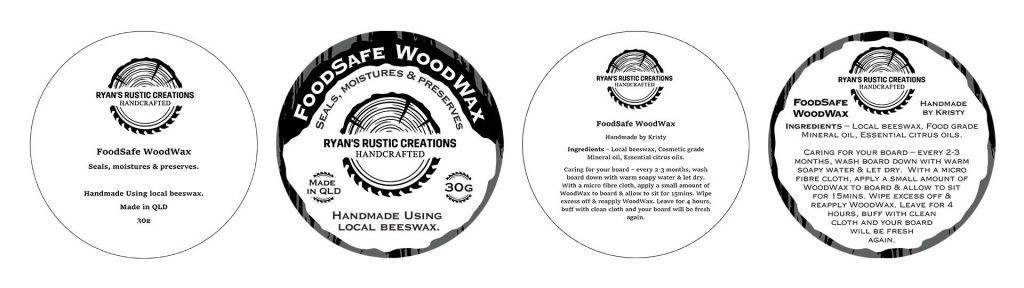
1 – The circular packaging
Typically a circle has no edge (ha!), so it is important to optimise the space. We don’t want the label to feel too cluttered or have big blank spaces.
Our answer:
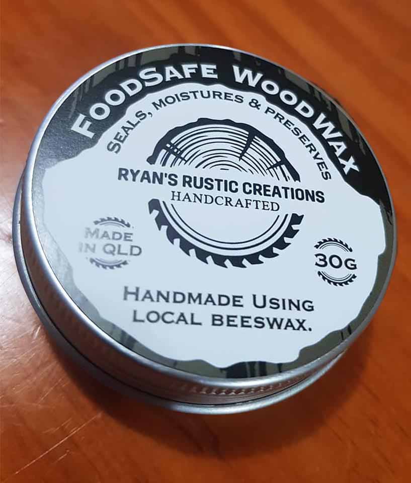
Instead of having square paragraphs of copy, we played with the round shape of both the packaging and the logo. For example, instead of being plainly straight, ‘FoodSafe WoodWax’ is curved around the packaging, on top of the label.
.
2 – The silver container
A tin packaging doesn’t allow to see what’s inside. And as consumers we are more prone to buy when we actually see what we’re getting.
Our answer:
The technique we chose here was to suggest what is inside with a woodgrain pattern. Here, we suggest the wax because we unconsciously associate it with wood. It also gave us the opportunity to add some texture to the packaging when a plain black background would have been too heavy and flat.

.
3 – The logo
Ryan’s logo was a low-resolution image (jpg). When we put it in our design software, it was appearing very blurry and would have looked even worst on the printed label. We couldn’t leave him with a poor quality logo!
Our answer:
We retraced Ryan’s logo, first to give it a cleaner shape, and second to be able to break each design elements apart. A high-quality logo made by a professional is useful to keep consistency throughout all your designs. Here, we used the saw element to enhance some of the copy (‘Made in Qld’ and ‘30g’).
.
4 – The client’s requests
Ryan already had a clear idea of what he wanted: an authentic look and a black and white design. He also had all the copy he wanted to appear on the packaging and he was keen to make Kristy’s name pop.
Our answer:
With these kinds of creative directives our main challenge was to give the label more clarity. We decided to play on contrast in shape (round vs straight) and emphasise (with bolder elements).
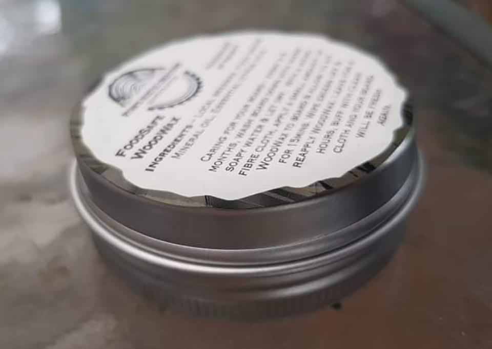
On the back label, we bolded ‘Handmade by Kristy’ and made sure it was in its own space.
.
The Results
We have to admit, we admire the foresight Ryan showed. He knew he would showcase his wax on his wooden artworks and that is why he wanted the label to be black and white: so it could pop-out better in pictures! He was thinking ahead to the promotion step. Check out this animated video showcasing the results:
Ryan was very enthusiastic with the result. He agreed that it looked a lot better, neater and more impactful. He proudly showcased it on his social media accounts… We’re excited to see that his professional looking packaging is well received by his followers!
Find Ryan’s Rustic Creations here:
At Visual Targets, we are experts in custom label design for your packaging and we would love to work with you to create the right and most impactful packaging design for your product.
.

Creative genius, talented wordsmith and all-rounder copywriter up for the grabs! If you can’t stand the look of your copy right now, she’ll shape your rambles into the most compelling words.
Marie Rene | LinkedIn


Hi guys I’m interested in food packing designed for my leafy greens business
Hi Bryce – we’d love to know more about the packaging, and your business! I’ll get in contact with you… 🙂