Case Study | Designing logos from different stages of advancement
A
s designers, we know that every logo will start from a different point. From a nebulous idea drafted quickly on a cafe napkin to the already half-done or almost there designed logo that only needs reshaping.
We never know what a new project will bring, but we are always up for it!
Here is the perfect example. Over the year, we designed a logo for each business of this family of 3:
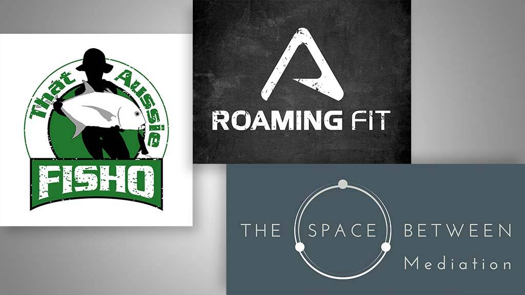
- That Aussie Fisho
- Roaming Fit
- The Space Between Us Mediation
The Story of That Aussie Fisho, The Space Between Mediation and Roaming Fit
That Aussie Fisho is a YouTube Channel and Instagram Account of a Fisherman posting some content about fishing and selling merchandising.
Roaming Fit invented a roaming fitness kit – including resistance bands – that people can take while travelling.
The Space Between Mediation helps mediate between people going through a divorce. We were contacted by Erin (from The Space Between Mediation) through Facebook. She hired us to cater first to her son Bailey’s business (That Aussie Fisho). Later on, they were so happy with the results that she asked us to design her partner Adrian’s business logo (Roaming fit) and then a little later on her own business logo.
The Challenges And Opportunities
That Aussie Fisho
1. The Logo

Bailey already had an outline of the logo and an idea of what he wanted.
The imagery: we redrew the character shapes and put the fish on an angle to give it a more dynamic look to how it was held by the character. The logo is inspired by a real picture the client took of himself with the catch of the day.
The use of silhouette for the character was an interesting one – using it meant that viewers of the logo could imagine themselves bringing the one who caught the fish, as the particular person holding the fish is less recognisable.
The colour palette: we chose black and green as the client has a recognisable green boat. Playing on strengths and things unique to your business is always a good idea.
The shape: we gave the logo this round label shape better suited for Instagram and YouTube profile pictures. The client wanted ‘Fisho’ to stand out, and to keep consistency with the rest of the logo, we slightly curved the bottom.
The texture: keeping in brand with the ‘messy’, visceral kind of activity fishing is, we went for a rugged texture. The font: after researching several bait and fishing shops, we saw that the market seems receptive to the ‘thick and thin’ type of font. So, we chose one of these for the logo, and also the bragging mat.
“Playing on strengths and things unique to your business is always a good idea”
2. The Bragging Mat

Fishermen use the bragging mat to measure their last catch – giving exclusive bragging right to the fisherman that caught the biggest fish!
The imagery: after doing some research, we found that the common measurements for this type of mat were 130 cm. We made it 120 cm to add the little mascot: the green hornet that already appears on Bailey’s boat. We also boldened the half line to make the measurement even more accurate.
The catchphrase: Bailey already had this clever catchphrase, “Keepin’ it reel”, and we decided to design a visual for it. It helps to understand the pun even quicker, and ‘fun’ is always a great seller.

3. The YouTube Banner

We kept the banner simple by showing the logo, the hornet mascot and the catchphrase. As it was going on YouTube, we designed one that would adapt to the device used to view it (tablets, smartphones, computers).
Roaming Fit
We started from scratch but had a great briefing session with Adrian to collaborate on the best direction for the logo’s look. Adrian is a wealth of knowledge in the fitness area, having been a personal trainer for the military in the past.
We extensively researched outdoor and fitness brands and created a mood board to set our artistic direction. We offered nine very different prototypes to the client. This way, we hope the client will relate to one style in particular.

This time, the client chose to go with the letter ‘R’ of option 5. This was because he liked how it hinted at the mountain and the outdoors. Also, down the line, he was thinking about adding to his brand name ‘Australia’, which would fit with the ‘R’, also looking like an ‘A’.
We delivered 2 final looks: one logo with the rugged-white texture on an asphalt road and the classic black and white.

The Space Between Mediation
Through research and personal experience, we knew Erin’s logo was almost there when she supplied us with some imagery she had developed herself. We just needed a cool idea to make it more defined and memorable.
We liked the idea of making the word in between pop – ‘space’ – and enhancing the impression that her clients were in a trusted space.
We designed that circle with 3 entities: 2 white ones representing the couple – still together on one half – and the mediator in dark linking this other half of the circle. Together they’re almost embracing and creating this space that inspires trust.
We placed ‘mediation’ on the side, in lowercase, to differentiate it from the uppercase text in the logo and to draw some attention to the type of business.
For us, a logo with a double entendre is knocking the ball out of the park! And we’re really proud of this one.

“We placed ‘mediation’ on the side, in lowercase, to differentiate it from the uppercase text in the logo and to draw some attention to the type of business.”
The Results
Erin was beyond grateful for our work and left us a glowing review on Google.
“Graeme was exceptionally fast to respond and to deliver work. The Logo, YouTube Banner and Design work surpassed my expectations. Very easy to work with, and I highly recommend him. I’m sure Graeme went over and above on the work quoted for and didn’t charge extra. He was genuinely passionate in his work and eager to please. Thank you so much Graeme.”
You can find the whole family on Instagram:
That Aussie Fisho: @thataussiefisho
Roaming Fit: @roaming.fit
The Space Between Mediation: @thespacebetween_mediation
.

Creative genius, talented wordsmith and all-rounder copywriter up for the grabs! If you can’t stand the look of your copy right now, she’ll shape your rambles into the most compelling words.
Marie Rene | LinkedIn


Admiring the persistence you put into your blog and in depth information you offer. It’s great to come across a blog every once in a while that isn’t the same outdated rehashed information. Great read! I’ve bookmarked your site and I’m adding your RSS feeds to my Google account.
Persistence pays off 🙂 Good to hear you’re enjoying the blog.