Featured image source: davisuko
Brand Identity is the sum of how your brand looks, feel and speak to people. To be effective, it needs to combine good strategy with creativity.
I
f you ended up on this article, you probably already know that building a strong Brand Identity is what can help make your business more successful. Done are the days of the cold corporation message only broadcasted through one medium!
Today your brand needs to be distinct, memorable, adaptable, cohesive, consistent, scalable with your growth and easy to apply for all your team members.
And what better way to learn than from the ones who built a strong identity perfectly fitted for their target audience?! We chose to analyse some of the brands we admire in 5 different industries to help you find the inspiration.
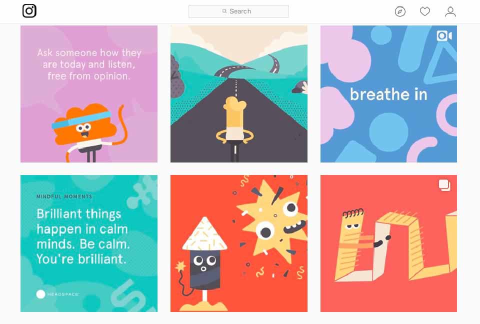
Health Industry: Headspace

Headspace is a guided meditation app with the colossal mission statement of improving the health and happiness of the world.
The look
Headspace features a cheery colour palette with pastel tones. Pastels are a great idea to allow the use of colours without being too bright. The impression is a feeling of softness; perfect for an app that’s suppose to help you feel calm and at peace.
They pushed it so far as associating colour palette with an emotion and a targeted market. You don’t need to go this far but check it out, it’s pretty inspiring.
They also decided to go with cheery illustration characters. These are perfect to convey emotions and they’re a great tool to give simple directions and explanations.
The words
Another thing to learn from Headspace is their tone of voice. They nailed their market analysis. Targeting sceptical or people in need of a little guidance, the voice is Andy’s; the one you hear during your session (if you don’t know Andy, we suggest you go have a listen, it’s quite calming): reassuring, simple, positive.
Personality: calm, clear, measured, authentic, with the occasional odd piece of light humour.
The customer experience

‘Meditation made simple’. And the user experience follows! Easy to access, to understand and to subscribe. No stress, you’re already in the mindset.
Most of all, they keep their identity consistent over their site, app, social medias and sponsored posts!
The results
Their branding is incredibly effective and impressive. And it works! Headspace celebrated their 1 million paid subscriber this year.
Fitness Industry: The Australian Open

The Australian Open went through a rebrand in 2016 to enter the new digital age of the adaptable logo, and we certainly applaud it!
The look
The Landor Agency was tasked with enhancing the brand in general and create a world of tennis. They eliminated the visual reference to tennis in the logo and got rid of all the stuffiness. Leaving it very simple but most importantly; adaptable. This new look is fresh, fun and playful – creatively, they have a lot more freedom to communicate and they did it well.
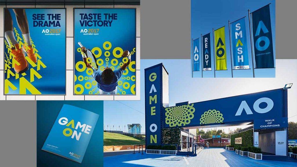
Our advice: if you know your brand will communicate through a high number of different mediums (brochure, website, side of a truck, social medias, t-shirts, etc.), spend some time designing a visual identity that is adaptable.
The words
The new, stylised initials personifies that energy and emotion the brand wanted to convey.
Their messaging is always bold, short and sets a challenge. They did a great job at finding a voice that engages their fans, sparks excitement and leave the spot to the main attractions: the players!
Personality: bold, athletic, fun, inspiring, passionate.
“a voice that engages their fans, sparks excitement”
The results
They really brought the brand in the digital world and made it a recognisable identity worldwide. A year after changing their identity in 2016, the attendance for the Australian Open smashed prior records, hitting an all-time high.
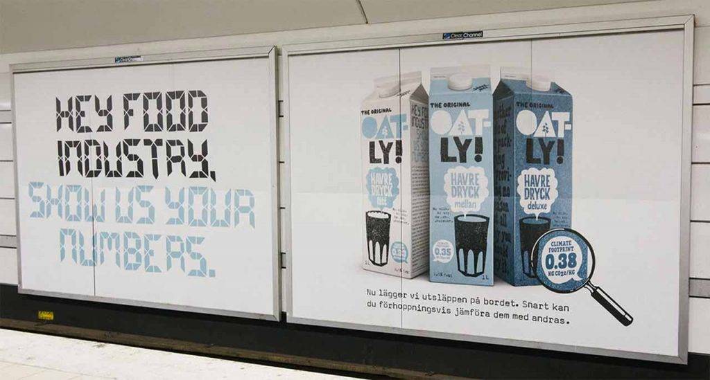
Food Industry: Oatly

The small challenger who overturned a whole industry by rebranding, Oatly’s brand identity is so good it accumulated quite the fan-base among marketers worldwide. Oatly is a Swedish oat milk company.
The look

The agency Forsman & Bodenfors took a timid effort at making a mainstream packaging that was lost in a thousand other milk products on the shelf and made it unmissable. Combining unpredictable designs with provocative thoughts, they used the packaging as their promotional space. You might have seen: ’it’s like milk but for humans’ or ‘Wow! No cow!’.
The words
Marketing 101: make yourself relatable. Oatly put their own CEO in their commercials! And we’re not talking boring and salesy but actual fun, relatable and educational content, making them feel less like a corporation and more like real human beings.
Oatly gives a glimpse of the people behind the brand while still wearing the face of the company and the brand appears more personable.
They’re also committed in providing a healthier solution for humans and being better for the planet and their copy reflects it. Showing that they truly looked at their target audience and decided to showcase their shared values.
“the brand appears more personable”
Personality: friendly, humble, authentic and cheeky
The results
A 50% sales increase over a 6 months period after the rebranding without releasing any new product. The milk industry’s numbers came crashing down and Oatly changed the face of the industry forever.
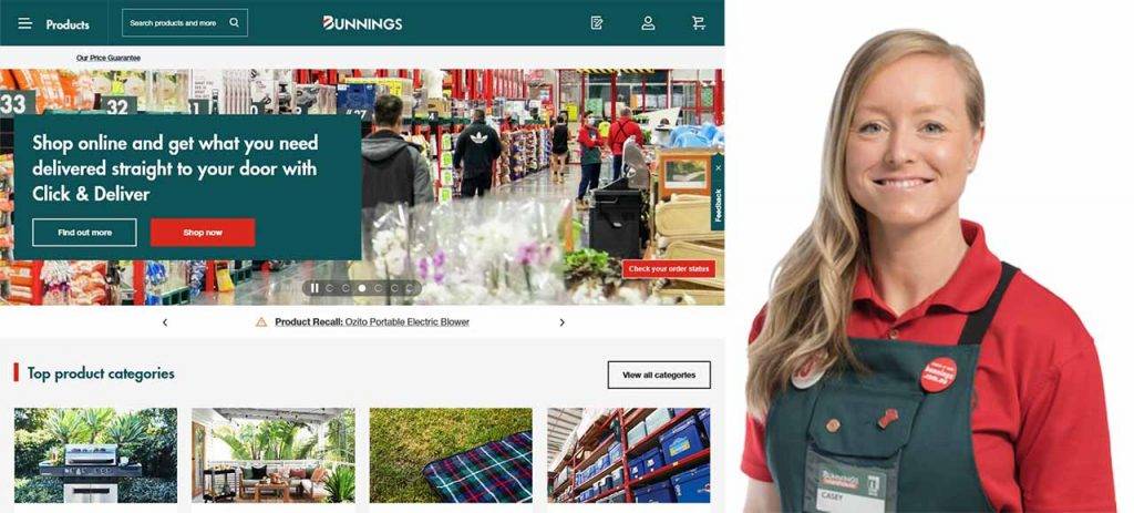
Retail Industry: Bunnings Warehouse
Famous Australian retail chain of hardware goods, Bunnings Warehouse has been around since 1886 and went through a major redesign in 1991. It has since been modified to include “Warehouse” to the logo.
The look
Wherever you are in Oz, we all have seen the recognisable large green building with the huge carpark in front of it and bordering a frequently used road. Looking at the visual identity, Bunnings kept it modest and simple: only 3 colours -with the green associated to outdoors and the garden- and an accent on the name with bold lettering. The visual identity is remarkable, joyful and energetic. Most importantly; it doesn’t exclude any gender.

The words
The brand appeals to “normal everyday people” who have specific needs and requirements, who want simple problems answered without any hassle. Their commercials show everyday man and women completing their DIY projects happily and their websites provide quick advice to answer their needs.
They also largely use the friendly face of their staff with the famous green aprons, creating this feeling of relatability and friendliness.
Personality: friendly, humble, authentic, helpful.
The results
Bunnings Warehouse built the hardware industry here in Australia and New Zealand. Whatever DIY project you’re starting, Bunnings has everything you need to complete it.
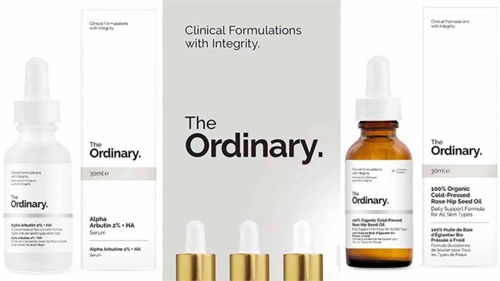
Beauty Industry: The Ordinary
The Ordinary is a skincare and make-up brand whose main selling point is the simplicity of their product. And they build their identity around this concept.
The look

Clear and clean. In a market already saturated with skincare and make-up products, The Ordinary chose the bold move of minimalist aesthetic. Instead of bright, overly feminine and flowery designs, they deliver transparency and simplicity with rigorous efficiency. The logo: a simple black on white font, the packaging: a monochrome white and bottles you could find in a science laboratory. A good idea to give this impression of expertise and innovation.
.
“simplicity with rigorous efficiency”
The words
Always with simplicity and honesty in mind, The Ordinary name their products after their main component. You thought putting ‘Niacinamide 10% + Zinc 1% Serum’ on a bottle wouldn’t sell? Well, it does. There’s a general fed-up feeling about beauty products who hide nasty chemicals and over-promise without delivering. And The Ordinary probably saw that in their market analysis. A great move to inspire trust and trigger a purchase.
They kept their tone of voice free of frills or empty claims. It states what is and that’s it. Their policies on animal testing, how the product should be used and who manufactured their products.
They enhanced that identity a bit on their social media where they’re careful about not appearing cold but kind and human.
Personality: integrity, kindness, humanity, honesty.
The results
A popular and accessible brand that is changing the mindset on beauty products. And their most popular product is said to sell one bottle every 3 seconds! (source)
Identity is an integrated part of your brand. You simply need it to sell. Because people tend to buy from brand they trust. So how to improve, your visual identity? Well you can have a look here, or check our FREE checklist to find your unique brand identity, or even contact us!
.

Creative genius, talented wordsmith and all-rounder copywriter up for the grabs! If you can’t stand the look of your copy right now, she’ll shape your rambles into the most compelling words.
Marie Rene | LinkedIn