
Featured packaging photography by: Jaya Mc Intryre from Empire Art Photography
Case Study | Packaging for Pyreken Pyrethrum
P
Pyreken Pyrethrum offers natural insecticides directly to customers but also businesses such as big retailers, pest control companies, schools, agriculture, and farmers in Australia and New Zealand.
Their business is situated here on the Sunshine Coast, Queensland, Australia – a fantastic part of the world which Visual Targets also calls home ☺.
They came to us to design the labels for all their product packaging.
Our objectives were:
- To design 4 master labels and their variations = a dozen labels in total
- To showcase that the products are 100% natural
- To create something consistent with the brand and the other labels
“the products are 100% natural”
The Story of Pyreken
Pyreken Pyrethrum has grown Pyrethrum (also classified as Chrysanthemum) in the highlands of Kenya since 1926.
The solvent extracted from the flower head is concentrated and tailored to formulate Pyreken’s highly effective products.
No Chemicals are used while farming the flowers. Farmers use traditional weeding practices because they do not have large farms. As such, the products are 100% natural.
Pyreken learned to work with nature and now aims to show a path away from synthetic chemicals.
The Challenges And Opportunities
1- Different bottles, sizes and packaging
Each packaging is different, so all the labels needed slight variations but always carried the same main information and the respective ones (mL, usage, etc.)
What we did:
We identified 4 main lines:
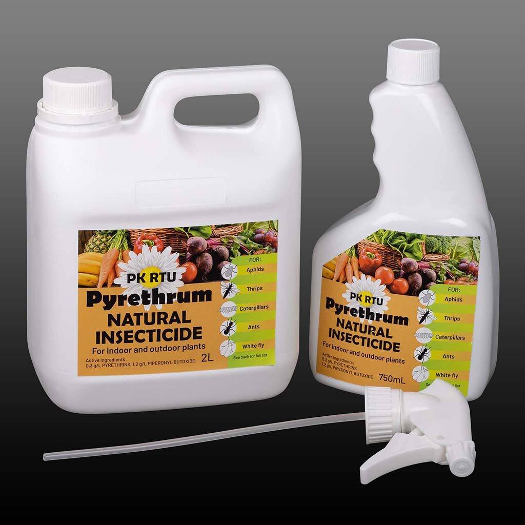
a) Pre-mixed pesticides for retailers like Bunnings.

b) The concentrated pesticides (not watered down beforehand) for pest control companies, farmers, schools and agriculture.

c) Industrial-grade concentrated pesticides for industries doing their own formulations.
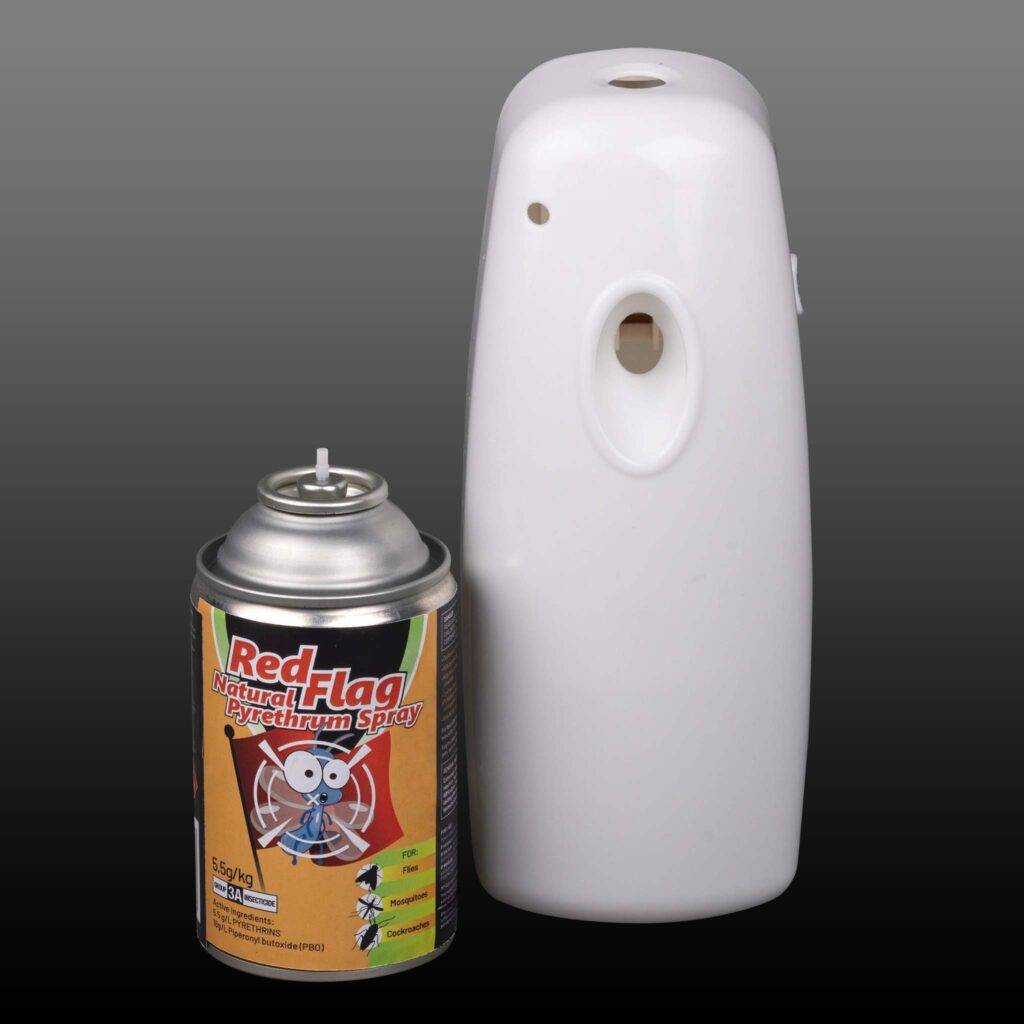
d) The aerosol with slow-release frame for customers.
We designed 4 master labels for these lines and their variations.
2- Conveying the right message
The point of sale for these products is that they’re 100% natural. Customers don’t expect this from pesticides, so we needed to make sure we conveyed this unique selling point.
What we did:
We redefined the flower to make it more ‘friendly’.
We spent some time finding the right colours for a natural pesticide. Usually, the industry uses blacks and reds to imply that the product kills. We chose green because it is the colour that universally hints at environmentally friendly products. We combined it with a rich orange for an earthy and warm note.
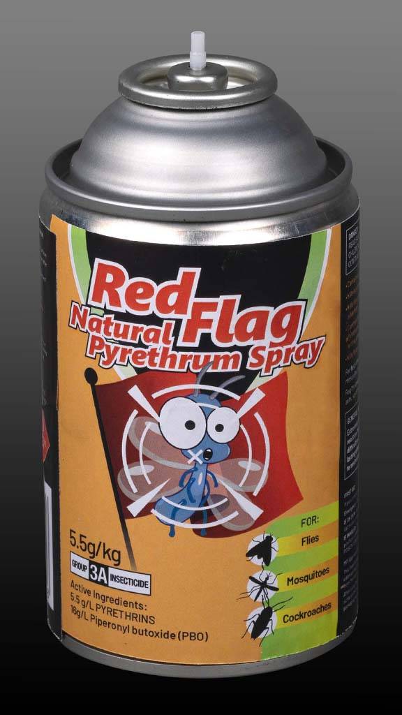
For the aerosol (sold directly to customers), we designed a humoristic insect in the target of a sniper.
Making the insect look more friendly and fun is an efficient tactic in this industry.
We added red and black to our other 2 colours, so the customer would find a familiar design and know straight away that the product is a pesticide.
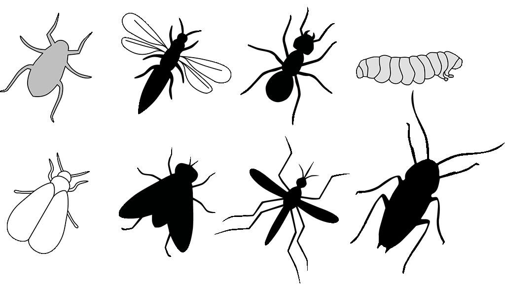
And we designed the silhouettes of the insects to clarify what the product kills:
3- Different markets & destinations
Pyreken operates in B2C and B2B in Australia and New Zealand. And they had different requirements for each market. For example, in Australia, they have a special line of products targeted to farmers producing fruits and vegetables, whereas, in New Zealand, the same line targets dairy farmers.
What we did:
Since the website changes whether the customer buys from NZ or Australia, we simply created 2 different labels. The products targeting Australia have an image with fruits and veggies, whereas the one for NZ has cows on it.
4- Warnings, regulations and bar codes on packaging
Pesticides must have rigorous information on how to use it and include multiple warnings. We made sure this important information was on the packaging.
What we did:
The client was very proactive in supplying thorough information for each product. It was just a ‘layout game’ (graphic designer speak) of playing with and adjusting everything to fit the label for us without taking away the general look and messaging.
We were also careful to add the correct bar code. This is less known to designers who don’t work on product packaging, but each line has a different barcode regarding weight, size, etc. In total, we had more than 10 barcodes to add.
“important information was on the packaging”

The Results
The client is very passionate about the product, and rightly so; this is an incredibly effective insecticide product while remaining natural – one that is rare in both the Sunshine Coast, and in Australia and New Zealand. So, when he told us he loved the labels and was very proud of the final results, we couldn’t be happier.
If you need help with your packaging design, partner with a designer with label experience! There are many requirements for certain types of products, and a skilled designer can help you with this
.
Creative genius, talented wordsmith and all-rounder copywriter up for the grabs! If you can’t stand the look of your copy right now, she’ll shape your rambles into the most compelling words.
Marie Rene | LinkedIn

