
Case Study | Showcasing packaging label designs for a Sunshine Coast food producer
A
local peanut butter company asked for our help to design their labels.
At Visual Targets, WE ARE peaNUTS for this type of butter (see what we did there?). So when this opportunity landed in our inbox, we knew there would be some market study necessary! And we were NOT disappointed. But you guys are here for the technical aspect, not for our culinary review. So, let’s dive in.
The Story of the Noosa Peanut Butter Company
Suellen Kirkpatrick, the founder of this small business was a referral from a previous client. When we met up, she explained that making peanut butter was her new venture. She hires a shared kitchen for a few days where she makes the peanut butter from scratch, all by herself.
What makes her peanut butter so unique is that she learnt to experiment with the flavours, and at the moment her range includes a chocolate flavour (did you say “yum”?), and… a spicy flavour! This is incredibly original and made us even more excited to work with her.
Plus, it is quite smart from a marketing point of view to have an original product that will attract the customer and make buyers remember her – “Yeah, remember that spicy peanut butter lady?” – even if they end up buying their regular smooth or crunchy peanut butter. It’s almost a catchphrase.
The Challenges And Opportunities
1 – Front circular label, and square back label
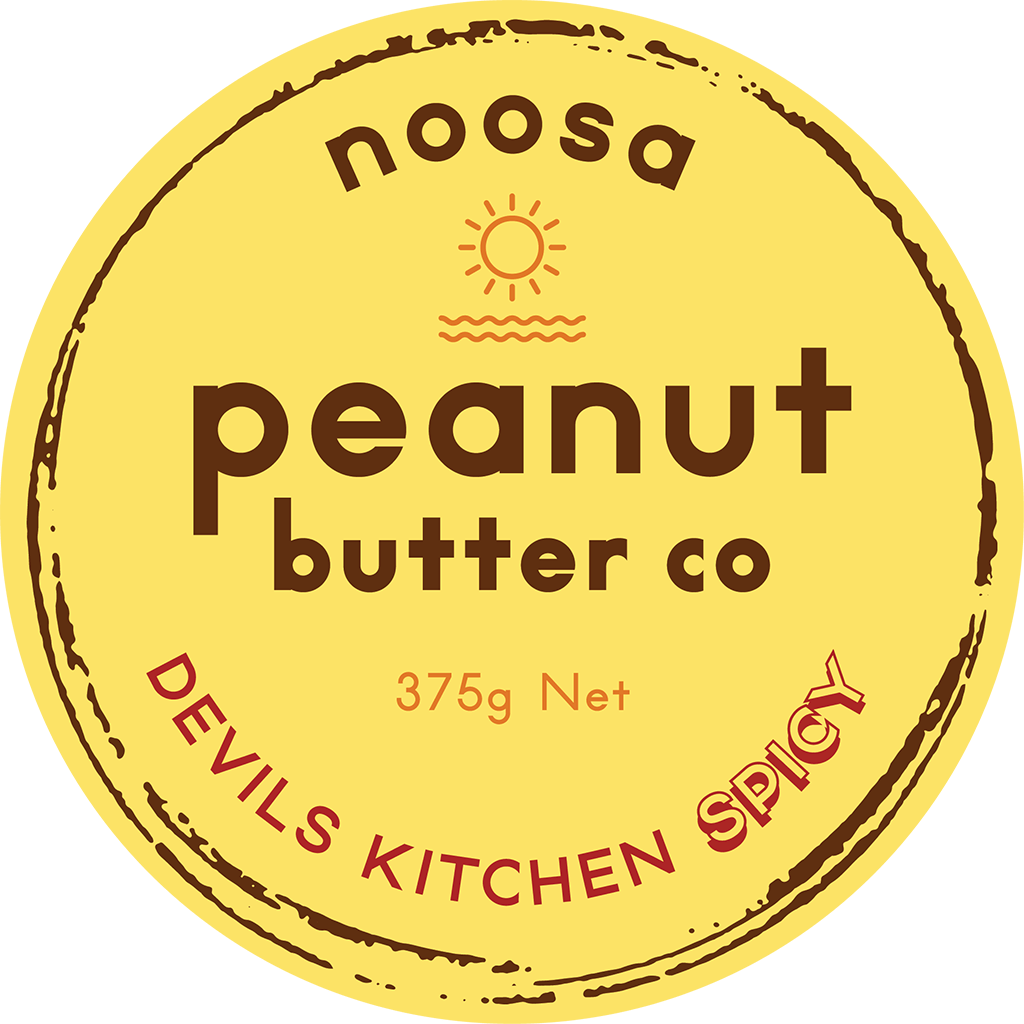
We know well how to do circular labels, and our previous experiences – see article here – made this one feel like a breeze. This label was mainly about choosing what should be put front and centre (the ‘grabby’ part if you will) and what to put second. “Peanut butter” is what attracts people first (they need to know what the product is), second, that it’s local with the “Noosa” and last the choice of flavour.
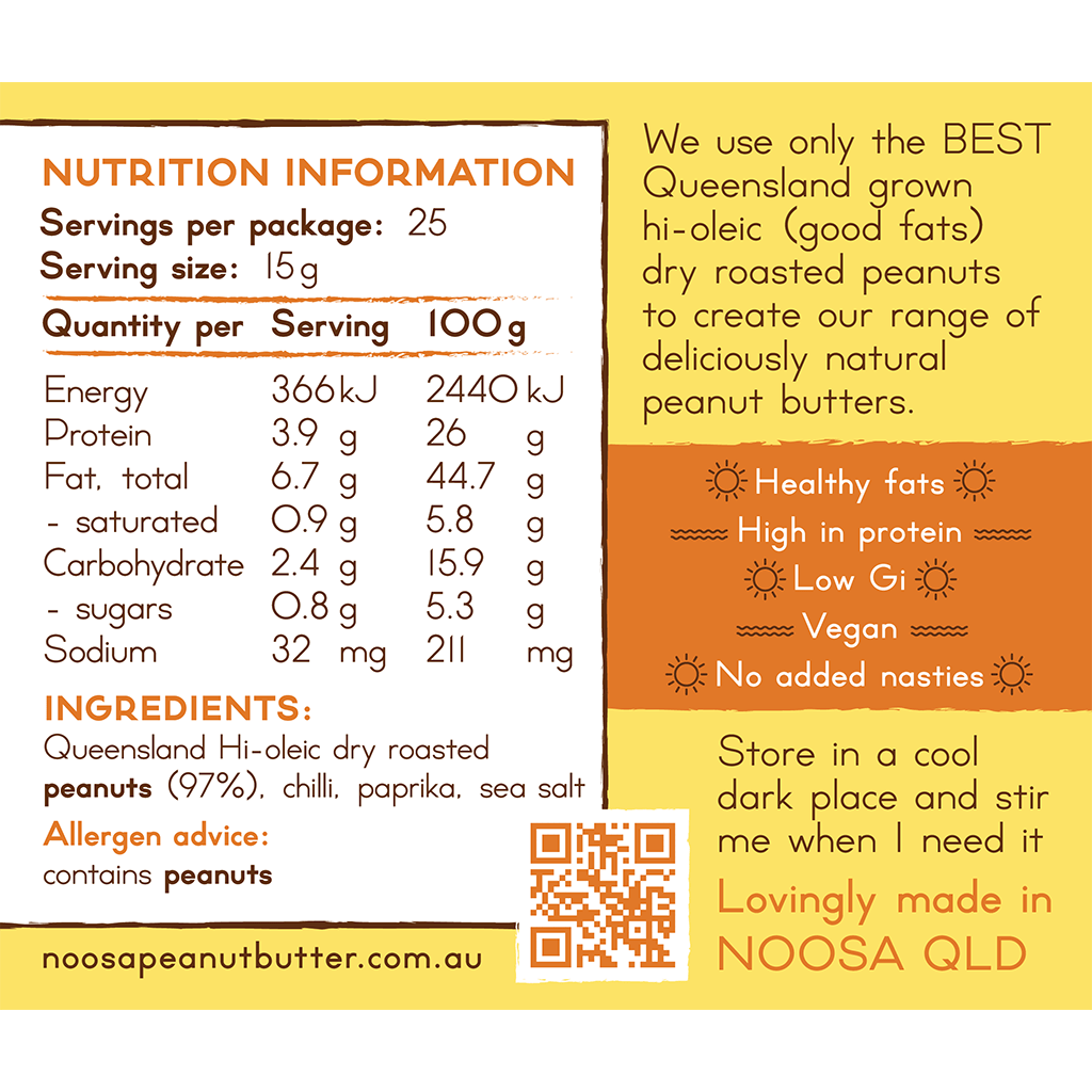
The square label on the back was all about the nutritional information. As we’ve seen before – here – it’s important to get the rules and requirements needed to avoid costly reprints. We did a fair amount of back and forth to get it right.
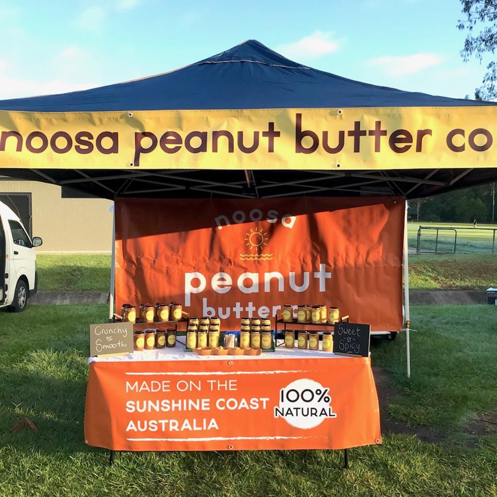
We also included the QR code to her website. This is useful especially because Suellen sells her product on a stall at the Yandina markets.
2 – The seal label

Suellen asked for this little but mighty seal that proves the product hasn’t been tampered with. We saw it as an opportunity for more judicious placement of copy and important information.
The “100% natural” and “made in Australia” especially resonate with the crowds present at the markets.
3 – The flavours – colours and names


To give it that even more ‘local’ relish, Suellen associated each flavour with a place in the Noosa National Park: Devil’s Kitchen Spicy, Laguna Bay Smooth, First Point Crunchy, and Boiling Pot Choc.
We applaud Suellen’s smart choice of names for her products!
This is inspired! As locals will recognise them and feel like the company is part of the community. It also taps into the good memories people already associate with these places, putting them in a good mood to buy.
For the colours, we wanted to follow conventions to allow people to recognise their favourite flavours straight away. Blue for smooth and orange for crunchy. Red for spicy and brown for chocolate were no-brainers. We did offer Suellen a few versions of the labels, including one where the colours stood out a bit more. But her preference was to do less. She knows her products and could tell that when in jars, people would already be able to tell them apart from the different shades of the peanut butter paste. That’s why we landed on this final version.
4 – The logo
Suellen already had a good idea of what she wanted as the logo. Our job was more about refining the yellow, giving it round edges, and overall just making it pop and aesthetically pleasing. The logo and label are versatile and can adapt easily if she wants to grow by making tubs and offering them to cafes and hotels.
The Results
“It took me a long time to search for a suitable logo designer until I finally found Visual Targets. Super happy I did.
Graeme and co at Visual Targets have been nothing but awesome in helping design my logo. I came in with a general idea and they were able to take it to the next level by carefully creating a stylishly punchy logo that stands out amongst the others.
Brings joy just looking at it. Thank-you.
I can’t recommend Graeme and the creative crew at Visual Targets enough. Don’t hesitate to get in touch”
Suellen Kirkpatrick – Google business review
Are you a food producer? We’d love to help you with your product:

Creative genius, talented wordsmith and all-rounder copywriter up for the grabs! If you can’t stand the look of your copy right now, she’ll shape your rambles into the most compelling words.
Marie Rene | LinkedIn

