Featured image source: MAX’s
T
he fitness industry in Australia is booming. Never has there been a better time for people to establish a career in this field. Just opening our socials, we’re bombarded with fitness exercises, cleanses, workouts, etc. As good graphic design professionals, we’re always interested in the trends of a booming industry!
Let’s take a look at some sports supplements packaging styles.
Before thinking about design & styles
Like any regular food packaging, there are a few things to think about before considering its design.
- Think TGA (Australian Goods Administration) compliance – gather the requirements that must appear on your packaging: nutritional label, ingredients, nutrient content claim, net quantity, dietary ingredients, warning statements (e.g. allergies), bar code, dosage, etc.
- Think type of packaging – is it convenient to use for your target audience? Whether it’s a satchel or tub containing powder or tablets, what would your consumer prefer? Dive deep into their habits, storage space, consumption habits and how much time they exercise per week.
- Think longevity – how and where is the package going to be stored? How long? Does temperature impact the product? Including label glue, material (paper or vinyl etc) and colours (some fade more over time).
- Think standardised scoop for different body types – can you make the amount recommended to consume easy to understand? And cheap for you to produce?
Remaking a label, after the fact can be time-consuming and expensive to print again. Best not to rush these steps!
Consider all the answers to those questions to give to your designer.
.
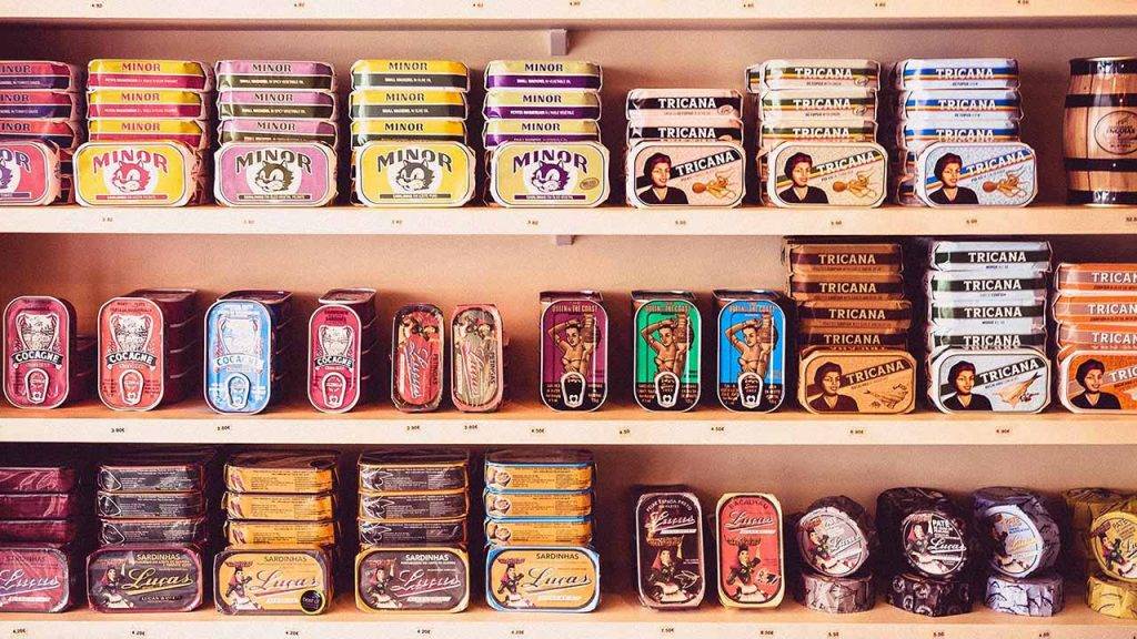
Design examples & what it says about their target audience
INC – Coloured ranges

INC has a recognisable silver and metal ink, and the majority of their products are usually in red tones, but they also created a green label for their plant-based product. This is a smart move to appeal to a different market base (vegans, organics). Even if it’s not innovative, when your product is on the shelves with dozens of other brands, the clever thing to do is use rules that your target audience will recognise. And green is internationally understood to hint at more natural products.
.
Genetix – Pure plain white

The plain white and the splash of water on the side of the label play on purity and cleanness. It almost has this medical look to it. This would appeal to the health adepts. Assuredly a big part of the fitness market.
.
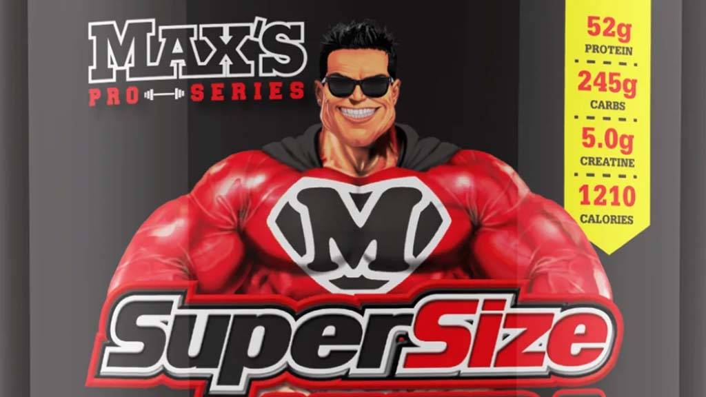
Max’s – A variety of mascots

MAX’S has a mascot for each range of products that is not without reminding us of a comic book drawing. Depending on the range, the mascot is either a superhero, an alterophile, or a scientist juggling test tubes. Everything is a bit over the top: colours, the fonts, the muscles on that mascot, as well as his facial expression.
All this gives a fun, boyish vibe to the brand, targeting men who want to have the build of a superhero or bodybuilders.
.
Musashi – Professional plain black

The plain black, minimalistic look, the silver line and the Japanese logo font give the product a very professional and high-quality look. It targets the elite and the athletes who don’t come to play but are serious about their training because they’ll need it to perform. The added “performance lab” on their website gives this scientific touch to the product that inspires trust because there’s evidence behind the product that proves it works.
The added “performance lab” on their website gives this scientific touch to the product that inspires trust because there’s evidence behind the product that proves it works.
.
Vital Strength – Flame imagery

Their label almost feels aggressive, from the flame imagery to the fonts. Aggressiveness in our society is usually associated with a more masculine energy, power and thus efficiency. The flames just enhance the benefit offered and stay in the same lexical field (“Pro-burn”). All this unconsciously enhances the efficiency of the product in the audience’s brain.
.
A few growing trends in supplement packaging
Environmental impact of the packaging
Many millennials are eco-conscious to the point of changing their buying habits. Most are willing to pay more for eco-friendly products. When it used to be a pain point, it is now a selling point for many sports nutrition brands —you might want to explore the sustainable packaging options at your disposal and set yourself apart (e.g. recyclable PET plastic jars).
Gender neutrality
Traditionally, the fitness and sports industry has been male-dominated, but the consumer base has expanded considerably to women. Don’t miss out on this opportunity! Packaging continues to shift to reflect this new dynamic with a more extensive colour palette and highlighting the health benefits. While some are still targeted at men or women, some products are moving to serve both (as seen in a few examples from the previous section).
Bright & bold imagery
While bright and colourful packaging is not new in the industry, it is still very much an actual trend. Vibrant colours stimulate customers, both tangibly and visually. Adding specific textures of matte versus gloss effect can capture consumers’ attention.
Some brands also use colour coding to identify health benefits or powder differences/actions.
Back of packaging
With a growing health-conscious audience, the back of the packaging is no longer a space to dump ingredient lists and nutritional values but a valuable space to promote the business. You can use it to highlight the advantages and sources of your product, or the history of the business, some driving values, inspirations, or anything that can give you an edge over your competitor.
Bulk Nutrients

Selling nutrients in bulk is a success story nowadays. Small businesses that don’t go through shops to sell their products just send them out themselves. In this case, satchels are considered the most convenient packaging to mail.
Your sales channels should be considered while choosing the best packaging for your product and designing your label.
Tip On-Target: If you decide to mainly sell online, considering your customer’s unboxing experience could give you a competitive edge and drive loyalty to your brand.
.
Label and packaging design is one of the trickiest and most overwhelming things to do for a business. Many of the requirements go beyond answering the question, “how to make this appealing?”. Our advice is not to take shortcuts! Turn to experts if you’re not sure.
.

Creative genius, talented wordsmith and all-rounder copywriter up for the grabs! If you can’t stand the look of your copy right now, she’ll shape your rambles into the most compelling words.
Marie Rene | LinkedIn